Some years ago I bought a dustbin bag stuffed full of GB material and amongst it were hundreds of this issue. At the time I noticed there were some differences in the printings but put them to one side and left them for many years. Recently I spotted some booklets for sale on an auction site and I figured here is my chance to nail down those different printings.
I’m focusing on the 20p Brownish Black (and Cream). Stanley Gibbons Concise GB lists three printings; Harrison & Sons using photogravure, Walsall using lithography and The House of Questa also using lithography.
The dates for these booklets are :
- Harrison : 30th January 1990
- Questa: 17th April 1990
- Walsall: 12th June 1990
In the Decimal Machin Definitives section of the Concise, Gibbons mentions that the photogravure has uneven lines to the value and frame. With lithography they mention clear outlines. These two following images show the difference more clearly. Click on the images to get them in a larger size.
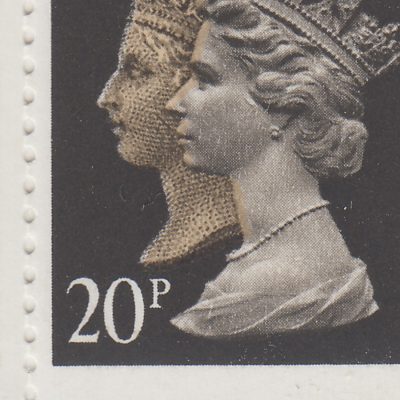
As can be seen, the Harrison printing has those fuzzy edges to the value and frame. The next one shows lithography…
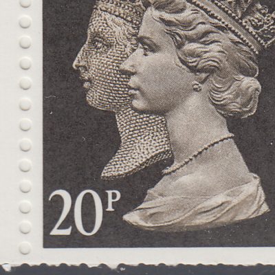
That printing is by The House of Questa. I scanned these images at 1200 DPI and you can see the differences quite clearly. Going in further with a microscope you can really see how fine the lithography printing is compared to photogravure.
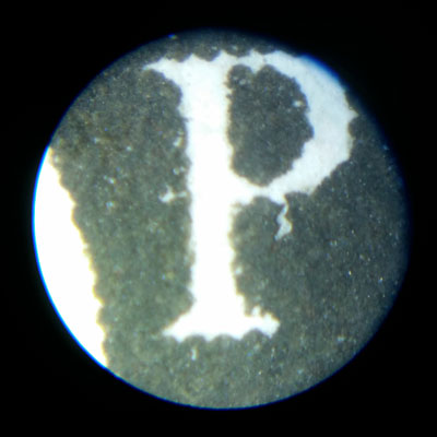
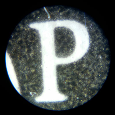
But you don’t really need either to tell the difference as they do look quite different by eye or magnifying glass. So here are the three printings in order as taken from the booklets that show the name of the printers. Again, click on the images to see them larger.
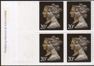
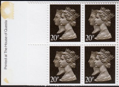
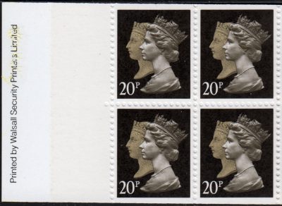
It’s clear from those scans that in the Harrison and Walsall printings Victoria’s head is cream coloured, whereas with Questa she more closely matches Elizabeth. But also have a look at how the engraving effect differs on Victoria. In Questa it is the most pronounced and it is somewhat finer on Walsall’s compared to Harrison’s. With Walsall Elizabeth is more silvery and smoother than the other two as well.
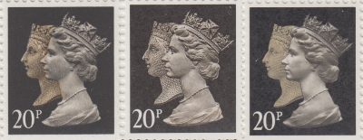
I’m sure you can see other differences that will help with other stamps in the set so I will leave that to you. It’s a nice set of stamps and was a great idea from Royal Mail. There are also some phosphor varieties to look out for as well, these are listed in Stanley Gibbons’ GB Concise as well.
Thanks for reading and I hope that helps someone somewhere !



Nice article – thank you. Somewhere I read that these stamps exist with “screened values” . Any ideas as to what this
means?
Hi Alistair, you’re welcome. Sorry I don’t know about the screened values. Someone over on stampboards.com will probably know.